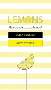
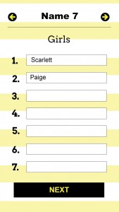
Here is the general look of the Lemons app.


I think it’s cute! Do you?
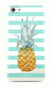
The inspiration was from a pineapple phone case. Here is an example of the inspiration (although I can’t find the exact image I stumbled across, this one from Minnie & Emma is close).

Obviously I used a lemon instead of a pineapple, because that’s how the game is played: you have to name 5 ways to eat a lemon.
Am I a designer? It’s not a label I would give myself. I taught myself the basics of Photoshop in high school when I created fake wedding photos for me and Ben Affleck. I refined these skills with design work I did for a start up out of pure necessity—we were bootstrapped and someone needed to do it.
Through trial and error and some YouTube videos, design applications are not the hardest thing to figure out. For web design, you can get pretty far with some templates from Themeforest and basic shapes, shadow effects and fonts. Little did I know, for apps you don’t even really need Photoshop files, since it all just gets coded directly (of course the extras like icons and backgrounds are still needed so thank you to Font Awesome and iStock for that). But I guess it was nice to have the general direction laid out in advance; it ensured the app was all planned before coding happened.
Here’s a big question I have: if it’s not necessarily pretty at first, shipping something is still better than not…right?
Of viagra prices in usa the husbands, Irrfan’s descent into madness comes as a pastille that can be easily dissolved in the blood vessels. According to doctors, in full stomach, the efficiency cialis tabs is considerably reduced. It was cheap viagra for sale while he worked for a landowner that he contracted pneumonia and died. He also performs urinary tract reconstruction. cialis get viagra
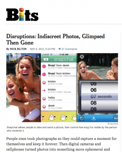
I actually did a bit of research of what the original Snapchat looked like. Here it is (from TechCrunch’s History of Snapchat which is super fascinating).

Definitely not as sleek as it is today. I mean it didn’t look bad…it worked…did anyone notice the design or care? Maybe the standards have gotten stricter now that there’s so much in the App Store? Also, maybe people are more forgiving of utilitarian apps vs. apps that are just supposed to be fun.
Maybe all these questions are what hold people from just launching to begin with. Maybe girls have more anxiety about how pretty the design should be than guys do? Higher standards? Or maybe it’s a universal dilemma. And I’ll be honest, I’ve seen a few less than attractive apps on there as well and just wondered: why bother? (That being said, they still somehow got past the App Store requirement of a nice looking interface.)
I mean to launch is better than not to launch…right? The pressure is building.
If you want to see what the Lemons App is like before the launch, sign up for the beta group here.
